Life expectancy in Norway
Last update
|In 2016, life expectancy was approximately 84 years for women and 81 years for men. There are large county and municipality differences as well as differences between educational groups.
Main points
- Life expectancy is an important indicator of public health status in a country or a municipality.
- In 2016, life expectancy was 84.2 years for women and 80.6 years for men.
- Life expectancy has increased more or less continuously over the last 170 years, interrupted only by the world wars and the Spanish flu pandemic in 1918.
- Since 1940, women's life expectancy has become steadily higher, increasing more than that for men. Over the last 20 years, the difference between the life expectancy of men and women has diminished.
- There are large regional differences between counties and municipalities.
- Since 1960, social differences in life expectancy have increased.
- Since 1960, Norway has gone from having the world's highest life expectancy to somewhat further down the world rankings.
- Norway has had a less favourable trend in mortality among the youngest and oldest age groups than other OECD countries.
About life expectancy
Life expectancy reflects mortality in a population and is therefore an important indicator of public health status in a country or municipality.
Life expectancy in any given year shows how long we expect a child born in that year will live. The calculation is based on the assumption that the death rate in the future will be the same as when calculated. This would mean that for every coming year, as many will die in the first year of life, childhood and adolescence, adulthood and old age as died in 2016.
In reality, conditions are likely to change and typical real lifespans will prove to be shorter or longer than the estimated life expectancy. Nevertheless, it is useful to make this theoretical calculation. Through annual estimates of life expectancy, we can monitor public health in a society from year to year, and we can compare municipalities and countries.
- Low life expectancy is a sign that many are dying at an early age.
- When life expectancy falls or rises, this reflects how conditions are changing for the worse or better.
- High life expectancy is a sign that many reach old age before they die.
In 1900, life expectancy was about 52 years. In 2016, it was estimated to over 80 years. This tells us that health conditions improved significantly from 1900 to 2016. We also see that the real life spans for those born in 1900 turned out to be much higher than 52 years.
We can also calculate the life expectancy of 1-year-olds, 20-year-olds, 60-year-olds and so on. The term “expected remaining life years” is often used. In countries where infant mortality is high, the expected remaining life years of a one-year-old is often significantly higher than the life expectancy at birth.
Life expectancy is higher for women than for men
In 2016, life expectancy in Norway was almost four years higher for women than for men, 84.2 years for women compared with 80.6 years for men (Statistics Norway, 2016).
We are living longer
In Norway, we can calculate life expectancy back to 1846 with reasonable precision, see Figure 1.
- Life expectancy in 1846 was about 50 years for women and some years lower for men.
- In 2016, life expectancy had risen to 84.2 years for women and 80.6 years for men.
Life expectancy has risen continuously from 1846 until today. Until the 1890s, growth was quite weak and with a great deal of fluctuation from year to year. It is nevertheless worth noting that the life expectancy in Norway was already best in the world in 1850.
As figure 1 shows, life expectancy has been higher for women than for men in the entire period from 1846 to 2016.
Growth in life expectancy was highest between 1920 and 1950. We then had a period of 20-30 years in which male life expectancy stagnated and decreased somewhat. For women, the trend was slightly better and the result was a big difference between male and female life expectancy.
From around 1985, male life expectancy began to increase again. Over the past 20 years, the difference in life expectancy between men and women has gradually diminished.
The same difference between men and women is also seen in countries where there is a natural comparison. The main reason is that after 1950, men changed their living habits to a greater extent and earlier than women.
Men started to smoke first and were also those first hit by the increase in smoking-related deaths, such as heart attacks and lung cancer. Women started smoking at a later stage and consequently experienced smoking-related deaths later. Similarly, differences between men and women may be linked to car accidents and other violent deaths.

Figure 1. Life expectancy in Norway 1846 – 2016. Source: Human Mortality Database, Statistics Norway figures for 2016.
Mortality has decreased in all age groups
Life expectancy is determined by mortality at all ages. When life expectancy in the early 1900s was much lower than today, it was in particular due to higher infant mortality.
In Norway today, most deaths occur in older age groups and mortality in these older age groups most strongly influence life expectancy. A percentage change in mortality in the age group 2-10 years gives a small effect because there are so few deaths in this age group.
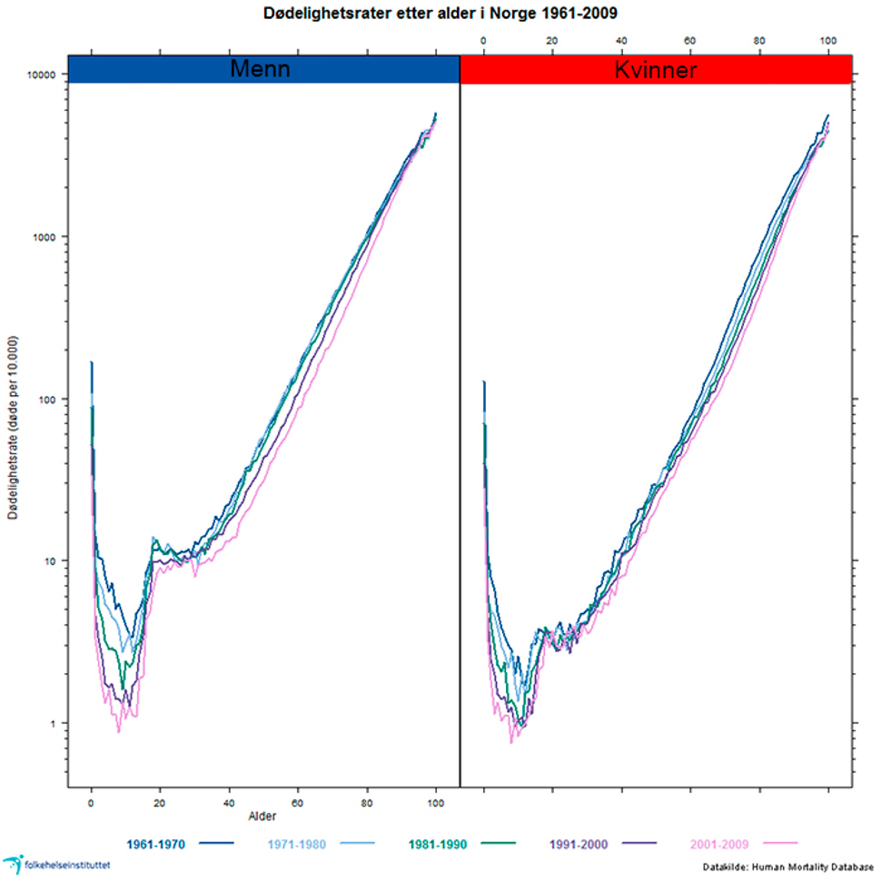
Figure 2. Mortality rates by age in Norway from 1961 to 2009. The figure shows the relative differences (note: logarithmic scale on the vertical axis). See comments on the figure below. Source: Human Mortality Database.
Comments to Figure 2:
Figure 2 above shows mortality rates (deaths per 10 000 in one calendar year) by age in Norway from 1961 to 2009. We can see that:
- Since 1960, the mortality rate has declined for babies and children and the decline is most pronounced for boys. The pink line shows the latest time period.
- For adult males between 30 and 70 years there has been a decline in mortality since 1990. We see that the purple and pink lines (for the period 1990-2009) are lower than the blue and green lines showing earlier periods.
- For the oldest age groups, we see no change; blue, green, purple and pink lines run in parallel.
- For adult women, mortality declines steadily over time, no single periods stand out. Also for women, there is a decline in mortality in the age groups over 30 years. However, for the older age groups there is a sharper fall among women than men, up to 90 years. We see that the pink line (2001-2009) for the entire period is lower than the blue and green lines showing the periods for 1961 to 2000.
Major differences between counties
There are differences between regions, counties and within cities in terms of mortality and life expectancy, see Figure 3a and 3b below.
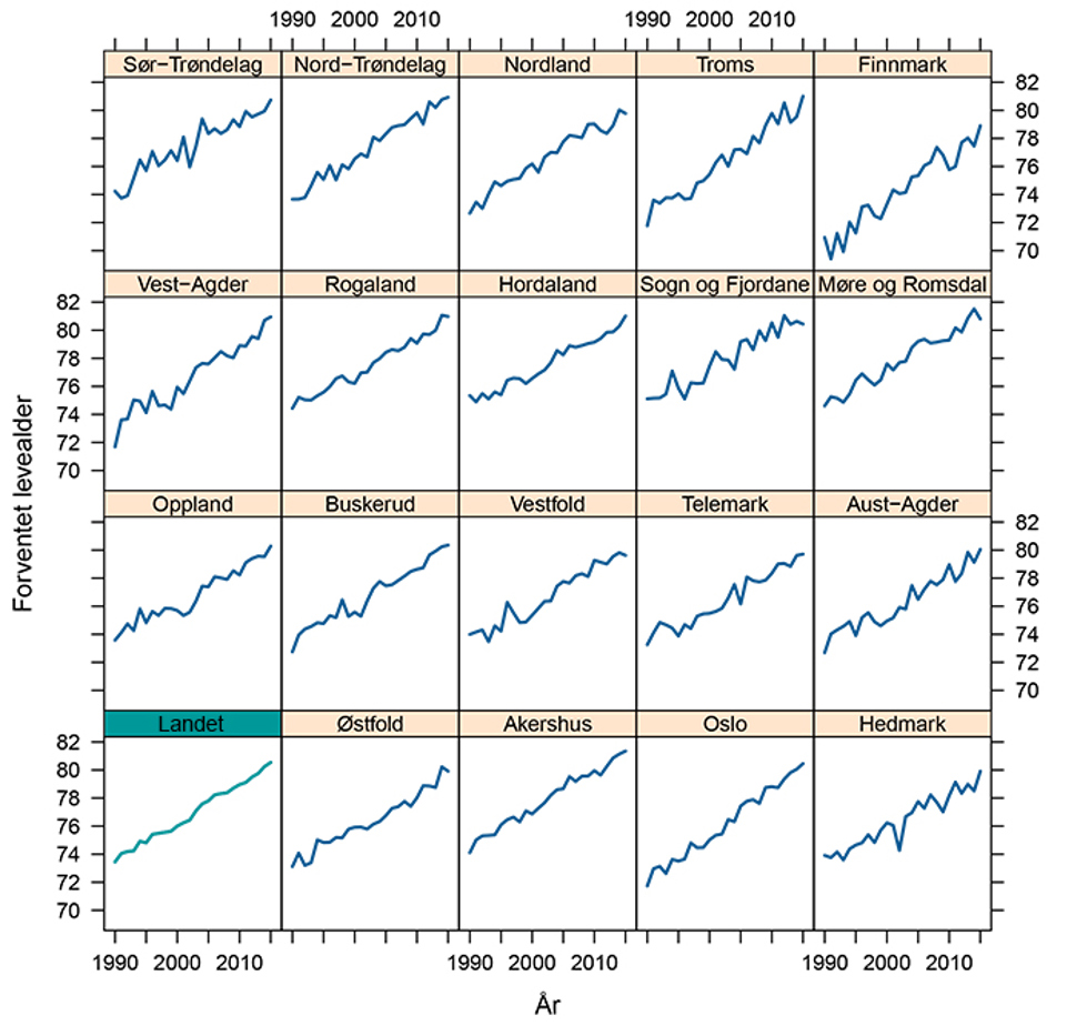
Figure 3a. Life expectancy for men in the country as a whole (bottom left) and the Norwegian counties from 1990 to 2015. See comments on the figure below. Source: Norwegian Institute of Public Health, calculations based on population statistics from Statistics Norway.
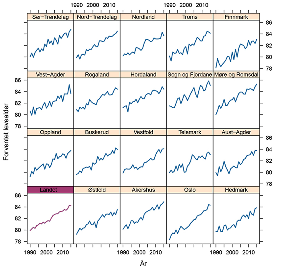
Figure 3b. Life expectancy for women in the country as a whole (bottom left) and the Norwegian counties from 1990 to 2015. See comments on the figure below. Source: Norwegian Institute of Public Health, calculations based on population statistics from Statistics Norway.
Comments to Figures 3a and 3b
Figures 3a and 3b show life expectancy among men and women in the whole country (bottom left) and counties during the period from 1990 to 2015. They show that:
- Life expectancy is highest in counties on the west coast and lowest in Finnmark, Østfold and Hedmark.
- In 2015, the difference between the counties was up to 2.5 years. For women, there was a difference of 2.2 years between Møre og Romsdal (highest) and Finnmark (lowest). For men, there was a difference of 2.5 years between Akershus (highest) and Finnmark (lowest).
- The differences between counties have been relatively stable over time but there is a slight tendency for the counties with the lowest life expectancy around 1990 to have the strongest increase in life expectancy thereafter. They have thus partially caught up to the counties with the highest life expectancy.
- Oslo has had a significant increase in life expectancy, while Hedmark only had a slight increase.
The geographical differences are even more striking when we compare municipalities and districts within the major towns.
- There is up to 10-12 years difference between men who live in the municipalities with the highest and lowest life expectancy. For women, there is 8-10 years difference.
- Within Oslo, for men there is up to 8 years difference in life expectancy between districts. This difference is about as large as the one seen for the whole country in the period between 1960 and 2015, see Figure 1.
Higher education - longer life expectancy
There are large social inequalities in mortality in Norway, where people with higher income, education and a job generally have the lowest mortality. It has been highlighted as a paradox that these differences are just as high in the Nordic countries as elsewhere in Europe, despite well-developed welfare systems with the same rights for all (Dahl, 2014).
- Men with higher education have 6.4 years longer life expectancy than men with primary education. For women, the difference is 5 years. See figure 5.
If someone is married, has a higher education and has a spouse with a similar education level, life expectancy is 8-9 years higher than for unmarried people with primary education (Kravdal 2017).
Increasing social differences in life expectancy
Analyses of data from 1960 to 2009 show a decline in expected remaining life years among men in the groups with the shortest education in the decade from 1960 to 1970 (Steingrimsdottir, 2012). From the 1970 until 2000, life expectancy increased in all groups, but most for the groups with the longest education. Women with a short education lagged behind and had the worst development (Steingrimsdottir, 2012).
Figure 4 shows life expectancy (at 35 years of age) in Norway 1961-2015 grouped by education level. As the figure shows, both women and men with higher education had the highest life expectancy during the entire period.

Figure 4. Life expectancy for men (35-year-olds) in Norway 1961-2015 grouped by education level. We see that those with higher education had the highest life expectancy in the entire period from 1961 to 2015. Source: 1961-1989: Steingrimsdottir (2012), 1990-2015: Statistics Norway/Norgeshelsa.no. The level of the figures from Steingrimsdottir (2012) are slightly adjusted for comparability. Grunnskole = primary, videregående = secondary and universitet/høgskole = higher education.
Figure 5 shows the difference in life expectancy between 35-year-olds with primary education and those with higher education for the period 1991 to 2015. As the figure shows, the difference is increasing for women during the entire period. For men, the difference increased until 2004, following by a levelling out until 2009. However, since then, the difference seems to be increasing again.

Figure 5. Difference in remaining life years at 35-years-old between those with primary and higher education in the period 1990-2015. The figure shows annual figures for the entire period (dots), plus a 5-year moving average based on that year's figures and the four preceding years (solid lines). Source: Norhealth.no
See also: Social inequalities
Other countries have overtaken Norway
One of the key goals of public health efforts is that "Norway will be among the three countries in the world with the highest life expectancy" (Parliamentary White Paper 34, 2013). Figures 6a and 6b show life expectancy in different countries in 2013. These are the latest figures for a representative selection of countries. As we can see from the figures, the difference between the countries with high life expectancy is small, particularly if we disregard Japanese women who have the longest life expectancy in the world.

Figure 6a. Life expectancy for women in different countries, 2013. Source: Human Mortality Database.

Figure 6b. Life expectancy for men in different countries, 2013. Source: Human Mortality Database.
Norway’s position in these rankings is somewhat arbitrary. Table 1 below shows the figures from various key international data sources. Norway varies between 11th and 17th position for both genders combined.
The variation is partly due to the various sources including more or fewer countries in the comparison and partly due to different agencies having different protocols for data collection and calculation of life expectancy.
Since the real differences are minimal, small differences affect rankings. For example, we see different countries in the "top three" among the five rankings. Small differences are also the reason why Norway’s position varies in the years 1990-2015.
|
PLACE |
GBD |
HMD |
OECD |
WBANK |
WHO |
|
1 |
Andorra |
Japan |
Switzerland |
Hong Kong |
Switzerland |
|
2 |
Japan |
Switzerland |
Japan |
San Marino |
Japan |
|
3 |
Iceland |
Spain |
Spain |
Switzerland |
Singapore |
|
4 |
Switzerland |
Iceland |
Iceland |
Japan |
Iceland |
|
5 |
Italy |
Italy |
Italy |
Spain |
Spain |
|
6 |
Malta |
Australia |
France |
Iceland |
Australia |
|
7 |
Cyprus |
France |
Australia |
Italy |
Italy |
|
8 |
Australia |
Sweden |
Sweden |
France |
Israel |
|
9 |
Israel |
Israel |
Israel |
Australia |
France |
|
10 |
Singapore |
Canada |
Canada |
Sweden |
Sweden |
|
11 |
Spain |
NORWAY |
NORWAY |
Liechtenstein |
Canada |
|
12 |
Qatar |
The Netherlands |
The Netherlands |
Singapore |
NORWAY |
|
13 |
Sweden |
New Zealand |
Austria |
Israel |
South-Korea |
|
14 |
France |
Luxembourg |
Luxembourg |
Canada |
The Netherlands |
|
15 |
Canada |
Austria |
UK |
NORWAY |
Luxembourg |
|
16 |
Luxembourg |
UK |
South-Korea |
The Netherlands |
Austria |
|
17 |
NORWAY |
Ireland |
New Zealand |
Bermuda |
Malta |
|
18 |
Austria |
Portugal |
Germany |
Luxembourg |
New Zealand |
|
19 |
The Netherlands |
Finland |
Hellas |
Austria |
UK |
|
20 |
New Zealand |
Belgium |
Ireland |
South-Korea |
Hellas |
|
21 |
UK |
Germany |
Belgium |
UK |
Germany |
|
22 |
Germany |
Slovenia |
Finland |
Faroe Islands |
Ireland |
|
23 |
Finland |
Denmark |
Portugal |
New Zealand |
Belgium |
|
24 |
South-Korea |
USA |
Slovenia |
Ireland |
Finland |
|
25 |
Ireland |
Czech Republic |
Denmark |
Malta |
Portugal |

Figure 7: Norway's position in various international comparisons of life expectancy from 1971 to 2014, both sexes combined. Norway's position is on the vertical axis. The curves show that Norway has fallen in the rankings since 1971, but that the exact position varies between sources and from year to year. Sources: GBD = Institute for Health Metrics and Evaluation (2016), HMD = Human mortality database (HMD, 2016), OECD (2016)), WBANK = World Bank (2016), WHO (2016).
If we follow the main trends, it is nevertheless clear that Norway has dropped from a top three position to a place slightly further down the list. Figure 7 shows the change in life expectancy for countries that for long periods after 1850 had the world's highest known life expectancy.
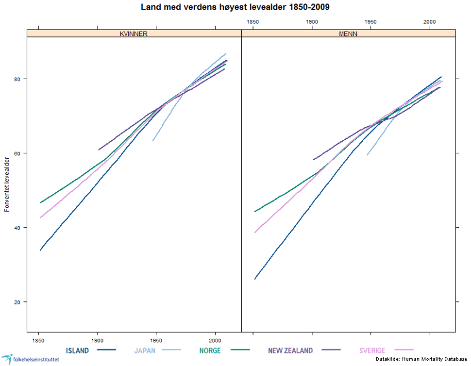
Figure 8. Life expectancy in countries with sustained periods of the world's highest known life expectancy from 1850 to 2009. Source: Human Mortality Database.
Comments to Figure 8
- A main feature globally is the strong convergence in life expectancy among this group of countries. Countries such as Iceland and Japan started much lower than Norway and Sweden but have risen faster and are currently even somewhat higher.
- Both men and women in Norway had the highest life expectancy from 1850 to the 1880s (green line in the figure). This happened at a time when Norway was one of the least economically developed countries in Europe.
- In the period 1947-1955 for men and 1945-1970 for women, life expectancy in Norway lay in the world top, narrowly ahead of Sweden (pink line in the figure). Later life expectancy has risen less in Norway than in many other countries, including Sweden.
- From 1960 until today, Norway has gone from having the world's highest life expectancy to further down the list. This means that developments in mortality in Norway have been less favourable than comparable countries.
For a more detailed overview, we can look at mortality at different ages. In Figure 8, mortality in Norway is compared with the OECD average and in Figure 9, Norway is compared with Sweden.
The figures are drawn as a map for each gender. The horizontal axis shows calendar year and the vertical axis shows age. The red and orange colours indicate that mortality is higher in Norway than in the reference population in OECD and Sweden respectively. Yellow indicates that mortality in Norway is on par with or marginally lower than the reference population. Green indicates that mortality is lower.
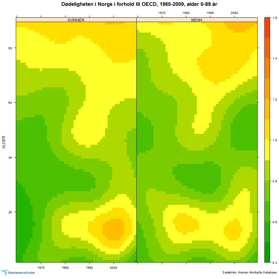
Figure 9. Mortality in Norway in relation to the total OECD population for all calendar years 1960 to 2009 and one year’s age groups 0-89. Orange = mortality is higher in Norway than in the reference population (OECD). Yellow = mortality rate is on par with or marginally lower. Green = mortality is lower.
Comments to figure 9
- In Figure 9 above, Norway is compared with the OECD. Ages are on the vertical axis. We can see that Norway has lower mortality rates for most age groups (deep green) early in the period but develops to having the same and higher mortality rates than the OECD today (from green to yellow and orange for several age groups). In other words, mortality decline in these age groups is weaker than the OECD average.
- The elderly as well as children and adolescents have had the most unfavourable development, we see that the colour changes from green to orange. The development among children and young people stands out but we must take into consideration that there are very few deaths in this age group.
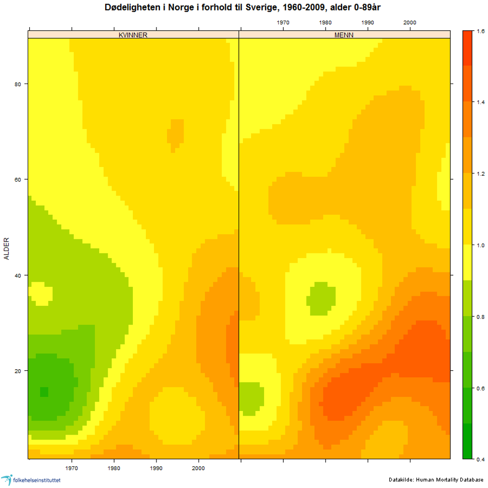
Figure 10. Mortality in Norway compared to Sweden for all calendar years 1960 to 2009 and one year age groups 0-89 years. You can read the development of an age group by finding the age on the vertical axis and follow the time evolution horizontally to the right. If the colour changes from green to yellow and red this means that development has deteriorated. Source: Human Mortality Database. Red and orange = mortality is higher in Norway than in the reference population. Yellow = mortality in Norway is on par with or marginally lower than the reference population. Green = mortality is lower.
In the comparison between Norway and Sweden in Figure 10, we see much of the same picture as in Figure 9. Compared with Sweden, the relatively unfavourable development for adolescents and young adults is even clearer than in the comparison with OECD in Figure 9.
Figure 11 shows the comparison of mortality in Norway and OECD by main categories of causes of death. The OECD average in this figure is calculated from European OECD countries.
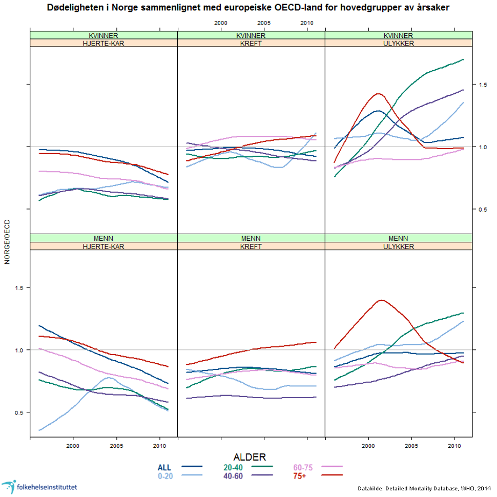
Figure 11. Mortality in Norway compared to other European OECD countries by main groups of causes. Women top, men bottom. The level in OECD = 1. The rates are age-standardised within each age group. The figure shows how Norway comes out in relation to the OECD in terms of cardiovascular disease, cancer and injuries / accidents Source: Detailed Mortality Database, WHO, 2014.
Comments to figure 11
Figure 11 shows that:
- Norwegian women have low mortality from cardiovascular disease compared with OECD (below the OECD average for all age groups, see the first part-figure)
- Mortality from cancer among Norwegian women is as high or higher than in OECD
For men there are not so clear differences between disease groups. Mortality is generally lower than in the OECD (the bottom two figures on the left).
For mortality from cardiovascular diseases and cancer, Norway comes out better than the OECD in terms of age groups under 60 years, but not for higher ages.
- Norway has a higher mortality than the OECD for accidents, especially for the younger age groups. It is worth noting the unfortunate development for young women in recent years (Figure top right).
- In 2003 and 2005, the international coding practice changed for overdose deaths (poisonings) and hip fractures associated with falls. This affects the curves for accidents.
